3 Key Tips on converting your website to responsive web design
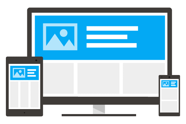
What is Responsive Web Design (RWD)?
Responsive Web Design (RWD) means that your desktop website literally responds and adapts according to the device on which it is read so that the user experiences the website as a completed entity which does not have to be modified in terms of size or any other elements.
Responsive Web Design uses the same url and code across all of its devices with the display changing according to the device. In this way only one website version is used, simplifying the Google indexing of website content in cyberspace.
RWD as a user driven necessity
As more and more users access the internet via their cellphone, it becomes imperative to create a B2B and B2C friendly website experience on a mobile device so that it is easy to read and facilitates immediate and easy interaction. If the user experiences difficulty accessing the information such as having to zoom in to view the page, or zoom out in order to read the font, the reader is soon going to find another website which is easier to use.
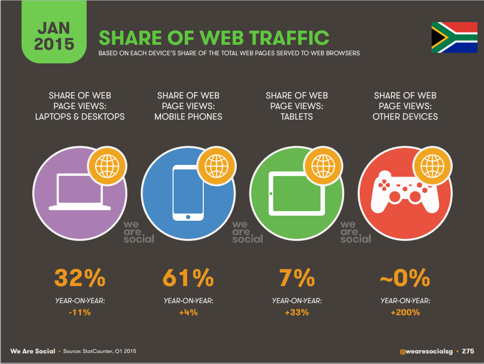
According to the January 2015 report from We Are Social the South African internet landscape shows a 24% increase in internet users, resulting in a total figure of up to 24.9 million.
Seen in the image below, the number of South Africans accessing internet via cellphones increased by 4% in the last year, while those using a desktop device decreased by 11%, showing the tendency towards other devices such as mobile and tablets (which enjoyed the most growth at 33%).
This is one of the main reasons for Google’s adding mobile-friendliness in April 2014 as a search ranking criteria with the aim of providing users with ‘relevant, high quality search results that are optimized for their devices.
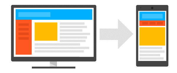
Transition from a desktop website to RWD
Converting a desktop site to a responsive site entails using the current content while organising it in a new way to accommodate the size and features of a mobile phone. Users also expect a customized version of the original website such as retaining the main essence of images or information, but presenting it in a more appropriate way for the mobile medium. For example, the main message of a political campaign may appear on the mobile screen as a moving image before it is centred on the device, drawing attention to the communication. Images may be used effectively in the foreground, enabling the user to invest emotionally in the mobile website content.
How to make a site responsive: 3 Key Tips
Google makes the following three suggestions when building a mobile optimised website:
1 – The ideal mobile site experience
- make it easy for your user to accomplish the objective for visiting the site (to buy, find information)
- Create a user friendly experience where the user achieves his objectives in easy steps
- The example below shows a 3-step process: Screen 1 – customer searches a lamp category → Screen 2 – customer selects lamp → Screen 3 – customer purchases lamp.
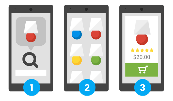
The customer is able to complete his objective and meets the brand’s call to action in the process.
2 – Customer task completion
Prioritization takes precedence in the mobile website, using images and strategically placed text to guide the user on his journey in order to ensure that the objective is accomplished and the user responds appropriately to the ‘call to action’.
3 – Making your site responsive
This can be achieved as follows:
- Expedite the process by hiring a designer to make the necessary changes to make enable responsiveness. This will facilitate happy users who can use the site efficiently while retrieving the necessary information or accomplishing their goals. A designer is familiar with the themes and which work best for your particular brand and target market.
- Selection of your responsive design template by using a responsive theme available such as WPtouch Pro which addresses Google’s prescriptions for mobile.
Mobile penetration is increasing with each year, making access to the device a critical part of maintaining your business communications with your customers. For this reason, it is advisable to have a site which can be read and used across all devices, optimising the user experience and the direct benefit of your bottom line as a result of the increased access to your brand.
* Images used from:
https://developers.google.com/webmasters/mobile-sites/get-started/how
https://developers.google.com/webmasters/mobile-sites/get-started/key
